Tips for Engineers – Making Successful Presentations

The presentation for the customer, performing at an exhibition or an internal meeting: again and again engineers have to face the challenge to present their developments. This isn’t everybody’s job. A frequent obstacle: preparing a PowerPoint presentation eats up time – and in the end it does not look that professional in many cases. The following basic tips should change that!
As a basic rule for presentations: Less is more. Reduce your speech and each slide to the absolutely necessary minimum. Keep statements, pictures and lettering clear and readable. Avoid long sentences. Each slide should convey only one single message.
Always keep in mind: the presentation should visualize your performance – but it is not the performance.
1. Master the master
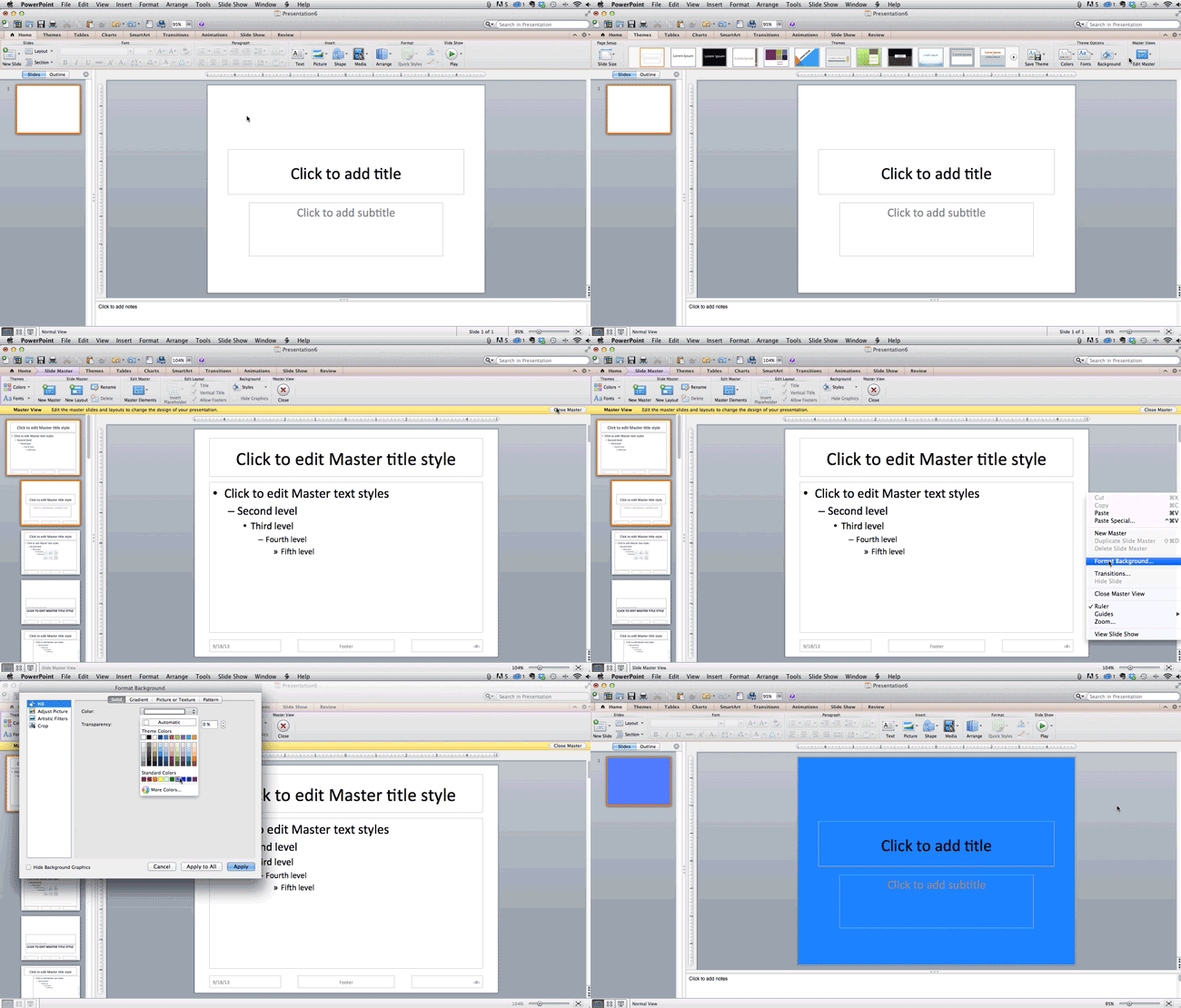
The slide master is helpful. Use this tool! The master slide allows you to define all basic design elements: colors, layouts, font sizes as well as fixed elements such as date, logo or name.
- For this, select the menu button “View” and “Edit Master”.
- On the left side you will see all available slide layouts (titel slide, image slides with or without text, text slides with different text boxes etc.)
- Clean up the view by deleting the slide layouts which you do not need for your presentation (don’t worry: whilst opening a new file the slide master is complete again).
- Edit the slides and boxes by choosing font types, colors, layouts, background graphics etc.
- Add fixed elements such as date, logo, your name or the project title by editing existing text boxes or adding new ones.
These settings apply to all slides but can be changed and edited at any time.
2. The teaching of fonts
Most information in presentation is still in text form. This is why the font is one of the most important stylistic elements. Besides guidelines such as corporate design, the readability is the major criteria for choosing font type, size and color.
- Use a sans serif font (e.g. Arial) because this type is much easier to read compared with fonts with serifs (e.g. Times New Roman).
- Chose as font size at least 24 points, 30 points is even better. The bigger the meeting room, the bigger the distance between the audience and the screen, the bigger font size should be used.
- Use formatting such as italic and bold carefully in order not to tire the eyes of your listeners and to improve the readability.
- Pay attention to the perfect contrast between the background color and the font color. But avoid too strong contrasts such as orange font on black background. This is also tiring the eyes of your audience.
3. Use graphs
Especially for engineers graphs are a perfect tool to illustrate technical matters. There are four options to integrate graphs in your presentation:
- A static structure diagram as JPG file
- An animated diagram as GIF file
- A static structure diagram in PowerPoint directly
- An animated diagram in PowerPoint directly
If graphs are available as static or animated file (JPG or GIF in most cases) you can add them to your presentation. Pay attention to the size of the file since it can get quite big with such graphs. Only use JPG and GIF files if they are understandable, legible and not too detailed or fragmented. Otherwise just recreate them in PowerPoint.
Since 2007 there is a link between PowerPoint and Excel as well as Visio. This means you are able to integrate graphs out of Excel or Visio or create Excel graphs in PowerPoint directly. For simple graphs this is a good option. But make sure that the layout of these graphs fits into the layout of your presentation.
For complex or bigger graphs this is not the perfect alternative though because they tend to be hard to read then. A good option: recreate these graphs schematically and focus on the key messages. SmartArt graphics are a great tool to visualize – but keep in mind not to exaggerate!
Tip: Do not only pay attention to the visualization but also focus on the labelling of your graphs. Here again, it is important to keep it legible and to the point.
4. The presenter view
A presentation is supporting your speech by visualizing your key messages. But it should not serve as your script. In case that you want to work with some notes, this is not reprehensible. Many people do so because they do not feel comfortable to speak freely.
If you feel comfortable with simple notes and if you want to avoid a chaos with pieces of paper you can use the presenter view which is available for PowerPoint since 2013. This view enables you to see different information than your audience. In addition to a preview of the upcoming slides, your notes and a timer help you to give a successful speech.
5. How to avoid that things go wrong
To make sure that things will not go wrong at the day of your presentation, make sure that you will timely:
- Check the spelling in your presentation.
- Make sure that there is a projector and a notebook available.
- Safe a backup copy on a flash drive and/or in a cloud. If web access is available, the presentation can be shown via Google Slides in that case.
- Print out additional information as handout and to distribute it after or during your presentation at the appropriate point.
Related Links:


Comment